It’s been well over 4 years since I started Out to Lunch, yet somehow this is only the fourth redesign.
Well, that’s not true in the strictest sense. I’ve actually been re-designing this site for about 18 months now, and since I’ve had a) more work to do (a good thing) and b) higher standards for myself (sure, also good), I’ve thrown out an entire visual direction except for the new logo.
This was a difficult decision, but the right thing to do.
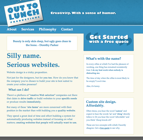
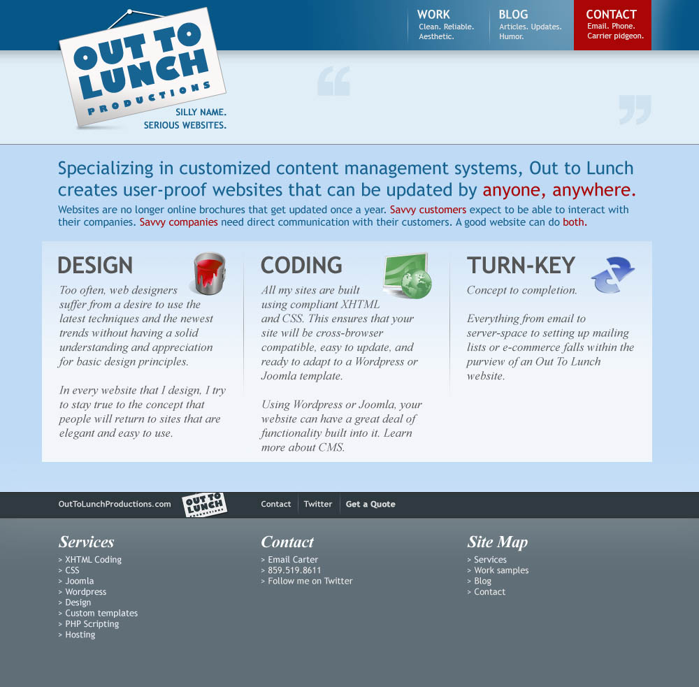
I wanted to make sure that the new design would be simple and sustainable. If you take a look at this screenshot:

…you will see that I was headed down an unnecessarily complex path.
If you dare, here are some legacy screenshots of previous designs; (ca. 2008), (ca. 2009) and (ca. 2010).
Responds Well (to Criticism)
Responsive design is all the rage these days, and the ever-increasing number of people who look at websites using various mobile devices is probably why.
If you’re not familiar with the concept, responsive design is a series of practices that allow the design accomodate variable screen sizes using the same source code. It ensures that your site looks its absolute best, no matter what the browser window size is.
Ethan Marcotte’s book got me going in the right direction on this. I used the equations he provides to create the flexible grid generator that powers this site (and anything else responsive I’m likely to build).
If you don’t want to resize your browser window (or can’t because you’re one of the many people who read stuff on their phones), check it out:


So many screens. Money well spent.
Something I can ignore
I do not get paid to work on this website. Sure, there’s the pretty direct benefit of it making me look like I know what I’m doing, but I can’t honor my debts with Futura.
Given the reasons I mentioned above (too much great client work, too high standards), my design requirements had to be whittled down to these three things:
- I don’t hate it.
- It doesn’t make me look like an amateur.
- I won’t feel the need to come back and tweak it every 3 months (really, another way of saying #1).
I feel like the new look accomplishes those goals. I won’t really know about #3 until at least 3 months from now, but whatever; that’ll be future Carter’s problem.
Come play with us
Right before I was going to release the new design, I had a sudden realization: slideshows suck, and I was using one to display my portfolio.
It was a painful thing to realize because I use slideshows everywhere. But I decided to replace the portfolio gallery slideshow I had on the home page with the grid you see now. This allowed me much greater flexibility in how each portfolio image was presented so everything would be more responsive, but it also presented a really cool opportunity to add some personality to the site.
Go to the home page and wait for 5 seconds. If you sit very still, the titles of the portfolio pieces will bounce playfully. Almost invitingly, one might say.
Discoveries like that are why I love doing this kind of work.